Airport Lounge Booking Experience
B2C · Mobile Design

Airport Lounge Booking
Sep - Dec 2025
Designing a Mobile-First Airport Lounge Access & Booking System
Problem
You're at the airport. Flight in 2hrs. You walk up to the lounge, join a long queue. Reach the front, hand over your cards, wait while the operator checks each one. You get a yes or a no.
What if all of this could happen on your phone, before you even got there? That's what Lounges on Hoi set out to solve.
Airport lounges in India operate on a system most travelers don't fully understand. Access is tied to cards, but the rules live buried in bank fine print (let’s be real, who even reads those). Customers stood in queues for a yes or no they could've had on their phones all along.
Challenge:
Build a mobile-first experience that lets users check eligibility, understand their benefits & book access on their own terms while turning a bank-dependent, operator-managed process into something self-serve & legible.
Understanding The Users
The users didn't have a discovery problem. They knew lounges existed. Many of them even had eligible cards. The real gap was between "I think I'm eligible" & "I know I'm eligible." We can divide them into 3 groups:\
- The uncertain card holder. A significant portion of users had multiple cards but no clarity on their benefits, they either assumed they weren't eligible, or found out mid-queue with people behind them.
- The paying user. Not everyone had eligible cards, but a small segment was willing to pay for access. The assumption going in was that users primarily wanted the free path. The reality was simpler: they wanted frictionless, regardless of cost.
- The on-ground user. Someone standing right outside the lounge needed an answer in under a minute. The urgency was completely different from someone checking eligibility at home the night before a flight.
Three different intentions. One product had to work for all of them.
How did we tackle it
This was built zero to one. No prior version, no existing data, no internal reference point. Everything from the architecture, the logic, to the edge case handling, had to be figured out from scratch. The research was market-led: competitor analysis, heuristic evaluation, mining app store reviews, & going through pain points helped us recognize patterns of frustration. Here’s what shaped every decision after:
- The card-benefit communication gap is a product problem, not a user problem. Users aren’t able to understand their benefits because the banks weren’t communicating it clearly & no product came in to make this any easier. When users added a card & saw "ineligible," they had no idea what it meant. Wrong card, expired benefit, spend limit not met; the label was accurate but communication wasn’t.
- Every major alternative (DreamFolks, Priority Pass) leads with card input before showing any lounge details. Users were hit by friction before they got any value. Hoi flipped this. Browse first, book later.
- Failure is a default case, not an edge case. API instability, invalid cards, expired benefits, mismatched card types; these weren't rare scenarios. The error states needed to be as considered as the success states, which meant failure handling wasn't a phase two concern. It was day one.
- And lastly, lounge information gap is real. Amenities, pricing, guest policies, access hours are the details which were entirely missing & users were making decisions with incomplete information.
Solution
The core architectural decision was to treat eligibility as a system. Rather than a linear booking flow, we designed a decision layer with defined states: eligible via card (free access), ineligible via card with fallback to paid & no card added with direct paid path. Every entry point fed into this layer. Every failure had a designated state & a fallback action.
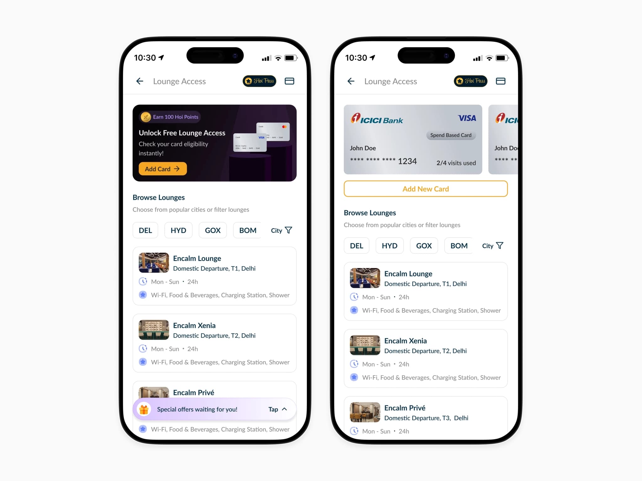
Lounge Listing Screens
Default state enabled lounge browsing without mandatory eligibility checks to avoid dead-ends, allowing users to explore options while being nudged toward unlocking free access.
After card addition, we place the added cards at the top with visit counts & benefit type visible at a glance; so users know their eligibility status before they even tap into a lounge.
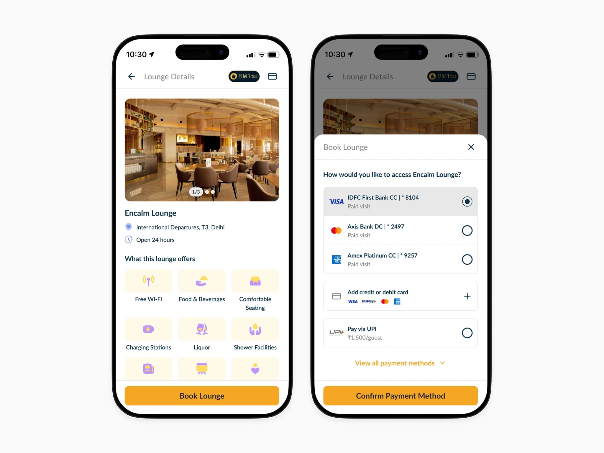
Lounge Details Screen
The key information (location, hours, eligibility, validity) is shown right upfront to reduce uncertainty, enabling users to make a booking decision without scanning the entire page.
Introduced card selection as a bottom sheet at the point of booking to keep the primary flow focused. The Axis entry showing "Paid visit" is intentional, we wanted show users the real context, letting them choose with full information rather than them figuring it out themselves.
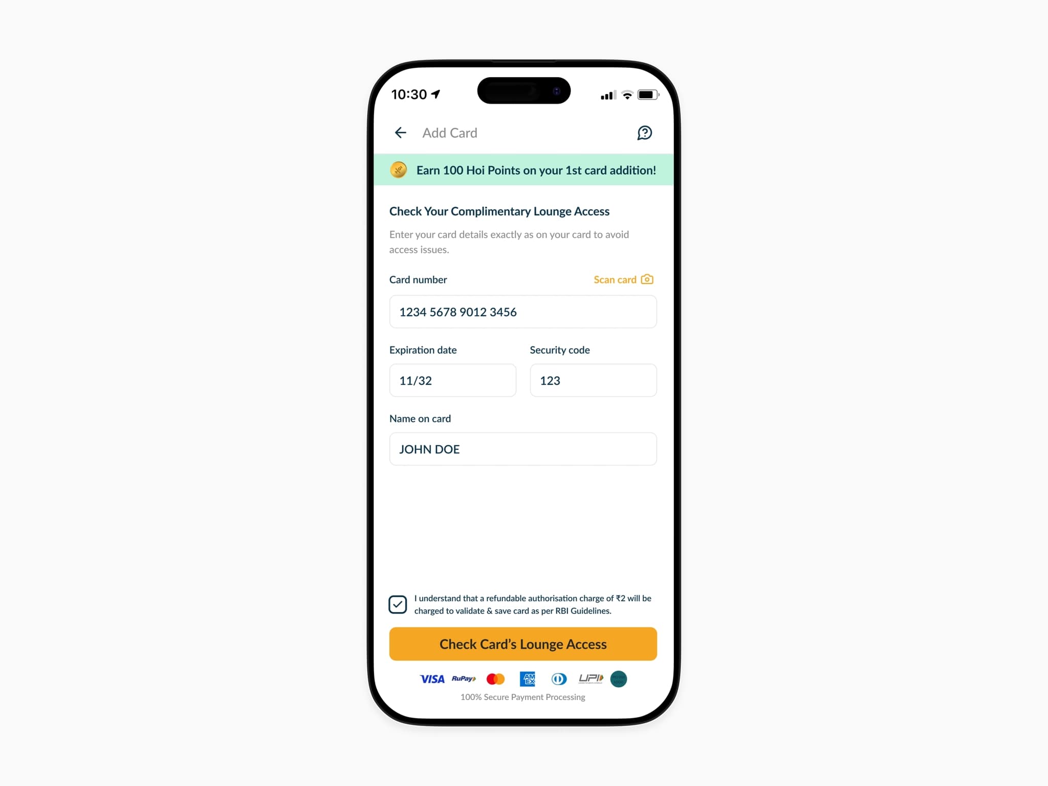
Add Card Screen
The add card screen needed to feel secure without feeling heavy. Two input methods: scan or manual entry, were kept visibly available at all times. The card scanning function was added for ease of use.
Not showing the ₹2 refundable charge in fine print was a deliberate call to protect the user relationship at a moment where trust matters most.
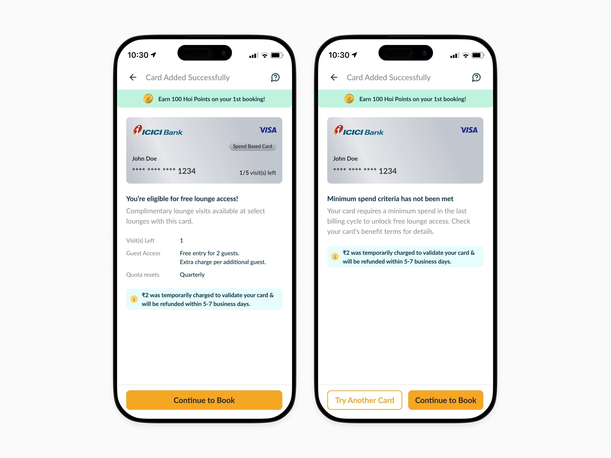
Add Card Results
We made eligibility outcomes explicit immediately after card addition to eliminate ambiguity, ensuring users clearly understand whether they can access free lounges or not. Paired with contextual details (visits left, guest access, or failure reason) helped users interpret outcomes & make informed next steps.
The fail state was the harder design problem. "Not eligible" with no context was the pattern every competitor defaulted to & the source of most support complaints early on. Mentioning the reason directly & immediately reassuring users about the ₹2 refund, meant the failure state isn’t a dead end.
Add Booking Details
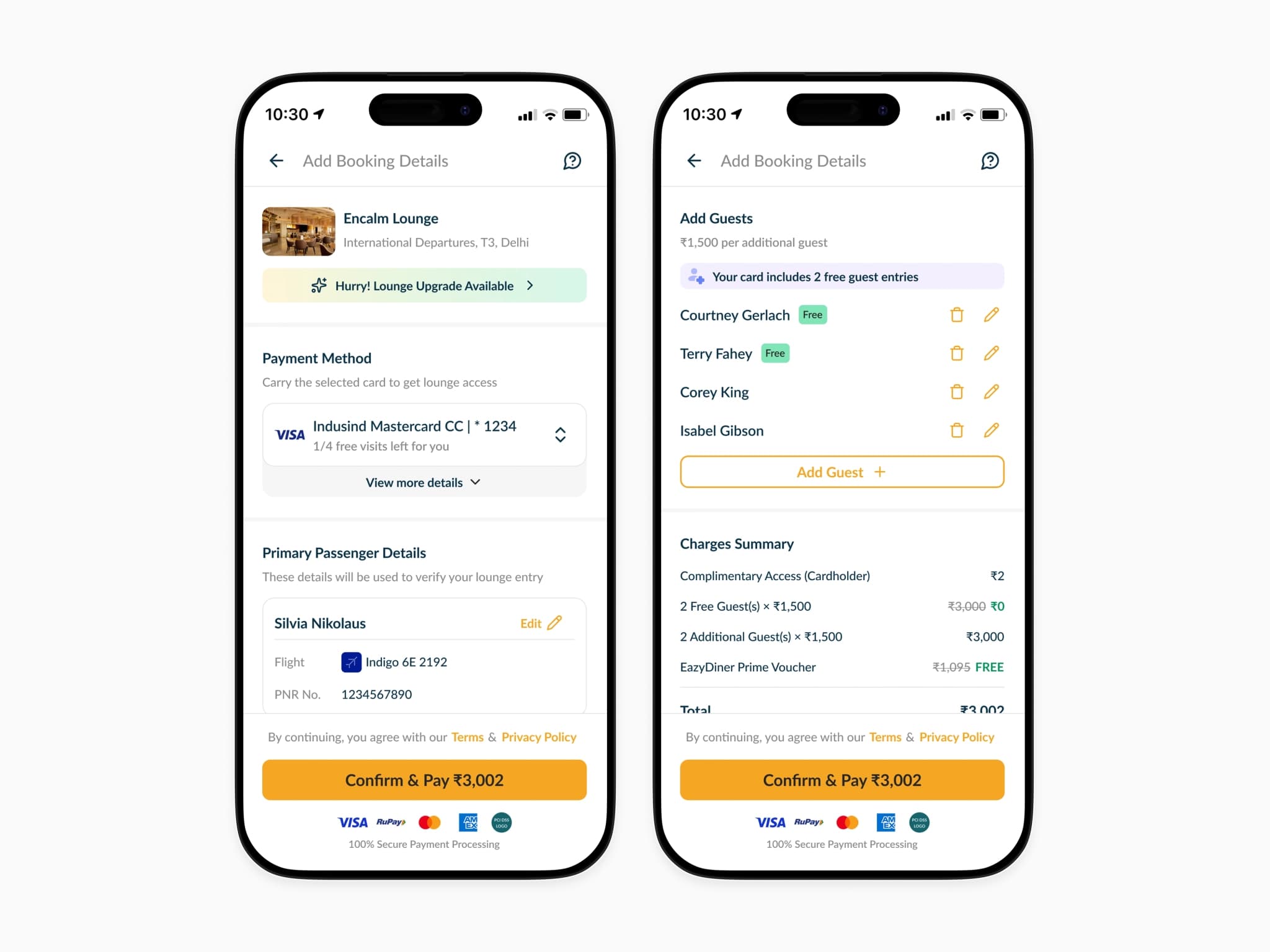
Guest pricing was a complex communication problem; free entries, paid entries, & additional charges all on one screen for the same booking.
Made guest addition dynamic & contextual (free vs paid) to clearly reflect cost implications in real time, reducing surprises at checkout.
Consolidated all charges into a transparent summary before payment, enabling users to validate total cost & proceed with confidence.
Booking Confirmation States
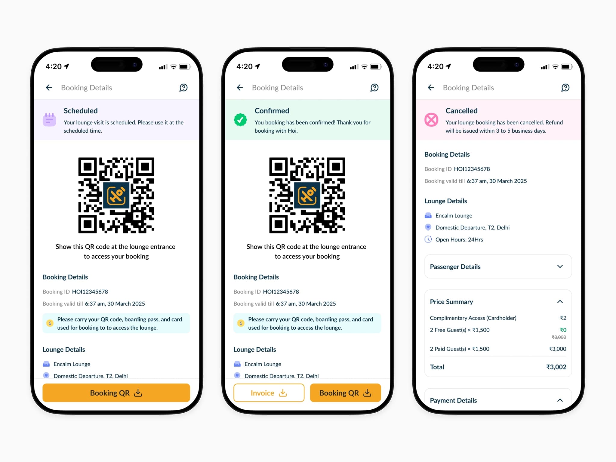
On the booking details screens, confirmed & scheduled states centre the QR code as the primary element because it's the only thing the user needs at the lounge entrance, so everything else is secondary.
The cancelled & expired states strip back to the essential information: what happened, what the booking was & what the financials looked like. Every state was designed with the same principle: a user in a stressful airport moment should never have to wonder what to do next.
The final results
The overall impact of this project was positive & numbers told a clear story about where user intent was concentrated.
We recorded up to 25% of the journey completion rate. 10k+ daily views on lounge detail pages, users were actively exploring before committing, which validated our hypothesis. 8k+ daily visits to the add card page & 4k+ card additions & eligibility checks per day.
Overall contributing to a 25% conversion rate from eligibility check to confirmed booking.
| Daily Card Additions | Daily Lounge Bookings | Conversion Rate |
|---|---|---|
| 4000+ | 1000+ | 25%+ |